Project Overview
Developing a module for a native mobile app for electronic service record to replace
paper-based documentation
Team
I worked with two product owners.
Company

Medium
Mobile nativeApp.

The context
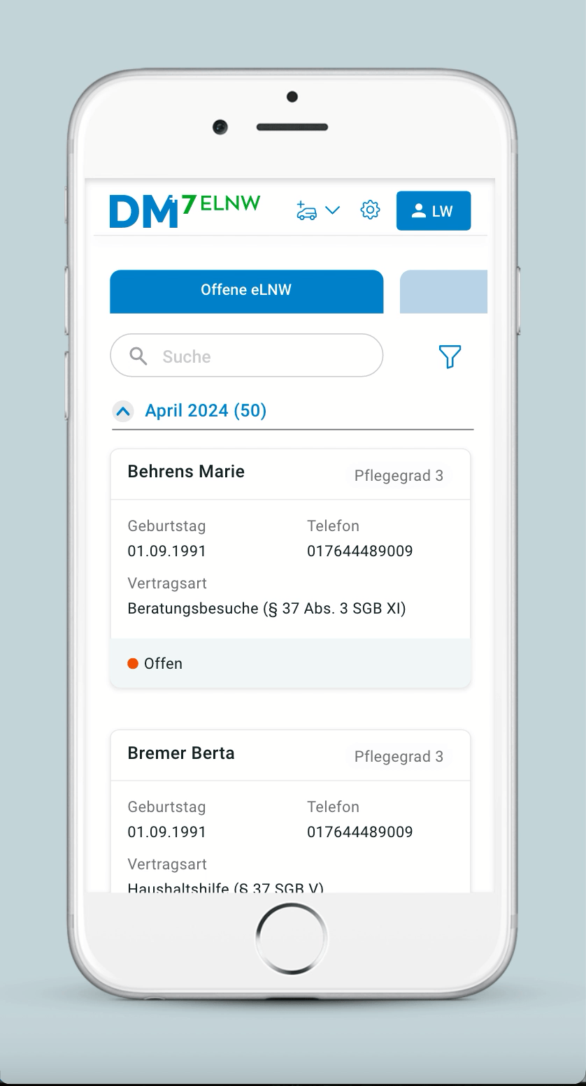
The electronic service record replaces the traditional paper-based “Leistungsnachweis,” enabling caregivers to document services on mobile devices and streamline administration.
From 1 December 2024, outpatient care services can opt for the electronic service record. From 1 December 2026, it will be mandatory.
The core problem

Patients, relatives, and caregivers can easily read the current paper-based documentation and sign physical forms without technical barriers.
The Goal
Quick and readable / understandable
for patients
The digital version should be simple to navigate, quick to confirm, and easy to read
Intuitive and training-free
User interface for caregivers
The UI must be familiar and self-explanatory, requiring no training for caregivers, patients and their relatives, as they are already using our CO products.
The solution
To solve this, I used similar navigation from our co-products to achieve consistency and design a solution that takes into account the user journey.
Designing Information archietecture considering user journey
User Story:- A care-giver has a tour in the last week of April, so he displays
a record of this service for the current month and receives signatures
from all the patients on today's round to confirm the services provided
for the whole of April.
Ideal Situation:- A care-giver opens the current record of the month
What If:- There could be a possibility of unsigned records from last months
He/She shows the record of the current month to the patient
Ideal Situation:- The patient or his relative signs the document
What If:- The patient does not agree with the document, he or she can refuse it, specifying the reason.
Ideal Situation:- Once the
patient signed the copy then
it can be archeived.
Step 1
Step 2
Step 3
Step 4

After Rejection:- The document will still be archived after refusing the service.
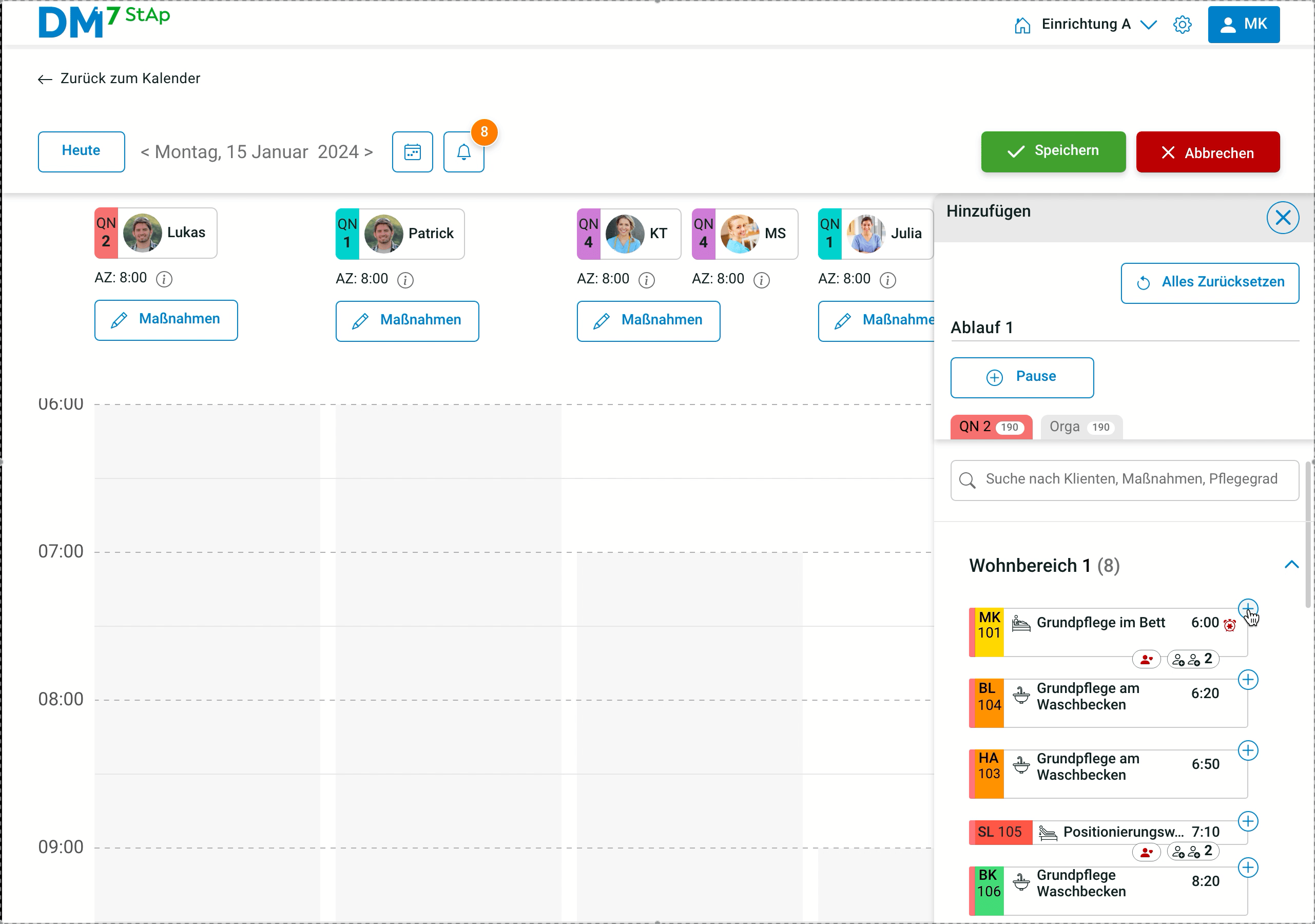
Challenge:- How to make this record form (Step 2 from the userflow) mobile friendly
With the help of PO, I was able to identify the hierarchy of information. This helped me create mobile-friendly layouts.
.png)
Title of service
Daily service details
Total hours spent
Exploring Layouts for the form
Vertical Layout
Logic
Each service can be opened individually
and scrolled vertically to view them all.
Here the user can see one service at a time.
Horizontal Layout
Logic
Each service can be opened in the same window and daily details can be scrolled horizontally, so all services can be viewed in one window without clicking.
Vertical layout is more functional and accessible
Due to the patient’s age and reduced vision capacity, A vertical layout is suitable for improved accessibility, this format supports better readability by allowing content to be consumed slowly and clearly, reducing cognitive and visual strain.
Defining target size for new components
Because of other products, cards, accordions, tabs, speech input have already been developed, Therefore, touch target sizes were defined according to WCAG guidelines only for the following components to ensure accessibility for patients as well.

Impact
Due to detailed, clickable prototype covering both positive and negative user scenarios, enabling developers to build the module with greater clarity, resulting in fewer revisions and improved implementation quality.
Lesson learnt
This project challenged me to design for a wide age range—from 30 to 80 years old and to address the distinct needs of two very different user groups:
working professionals and elderly individuals.
Takeaways