top of page
Upgrading manual daily inpatient facility planning from sticky notes & pin boards to a digital tool.


Project Overview
A responsive web tool for replacing manual tour planning in inpatient facilities.
Team
I worked with one product owner,
one nursing manager, one marketing expert,
one software architect, one apprentice, and external service provider team of seven.
Company

Medium
Desktop / Tablet Webbased App.
The core problem
Healthcare service providers struggle to create fair and efficient schedules for caregivers and specialists due to several overlooked factors, including:
1. Planning Gaps in Work Hours
2. Unplanned Sudden Events
3. Mismatch Between Nursing Tasks and Professional Expertise
4. Weakened Nurse-Patient Bond
This cause stress among the employees and leads to mis-hiring.
The current planning - Flow chart at Leverkusen Facility
Time line
There are planning gaps.
List of employees
The qualification and schedule of each is absent.
.png)
Tasks
Roughly indicated.
The colours have
no meaning.
The solution
Introducing “Stationäre Ablaufplan” a digital tool to help healthcare service providers make faster decisions, efficient staffing, better care, and fewer scheduling errors.
1. Fair Workload Distribution
2. Real-Time Workflow Adaptation
3. Intelligent Task Matching
4. Enhanced Care Quality
Plan overview

Information sorting
My apprentice and I sorted patient and caregiver data, along with their tasks, to identify key information that needs to be communicated through the interface.
Before
After


Before
After


Exploring and designing ideas
I explored various options in form of wireframes to figure out the possibilities and constraints which was very helpful to decide the direction of further improvement.


Logic
Employee schedule appears first;
measures adjust accordingly.
Early feedback from internal development team

Create a group of short duration and a large number of tasks
Avoid horizontal & vertical scrolling with timeline.
It's difficult and time consuming to develop.

Filtering down the scope of application
In order to prioritise what features would create the most value
in the shortest amount of time, I worked with PM and product ops
to strategize a plan for MVP features
Employees’ view
-
This view is important as each employee works according to their qualifications and working hours.
Daily planning
-
As per PM, they plan for seven days and copy the plan for the next week.
-
The daily schedule may change due to sudden events (e.g. staff illness).
Calculation of worktime
-
To understand how much time has been planned instead of number of tasks
.png)
24 hours scheduling (from 6 a.m. today until 6 a.m. the next day)
-
Each employee has flexible shift timings. hence plan can’t be sorted under shifts.

Notifications
-
On employee sick leave
-
About tenant's measures if this changes the planning.
Saving the plan
-
Only one employee can edit the plan at a time to avoid conflicts and errors.
Tabs
-
The tasks can be grouped by qualification level.
Search
-
The planner can filter measures by care level, floor and time.
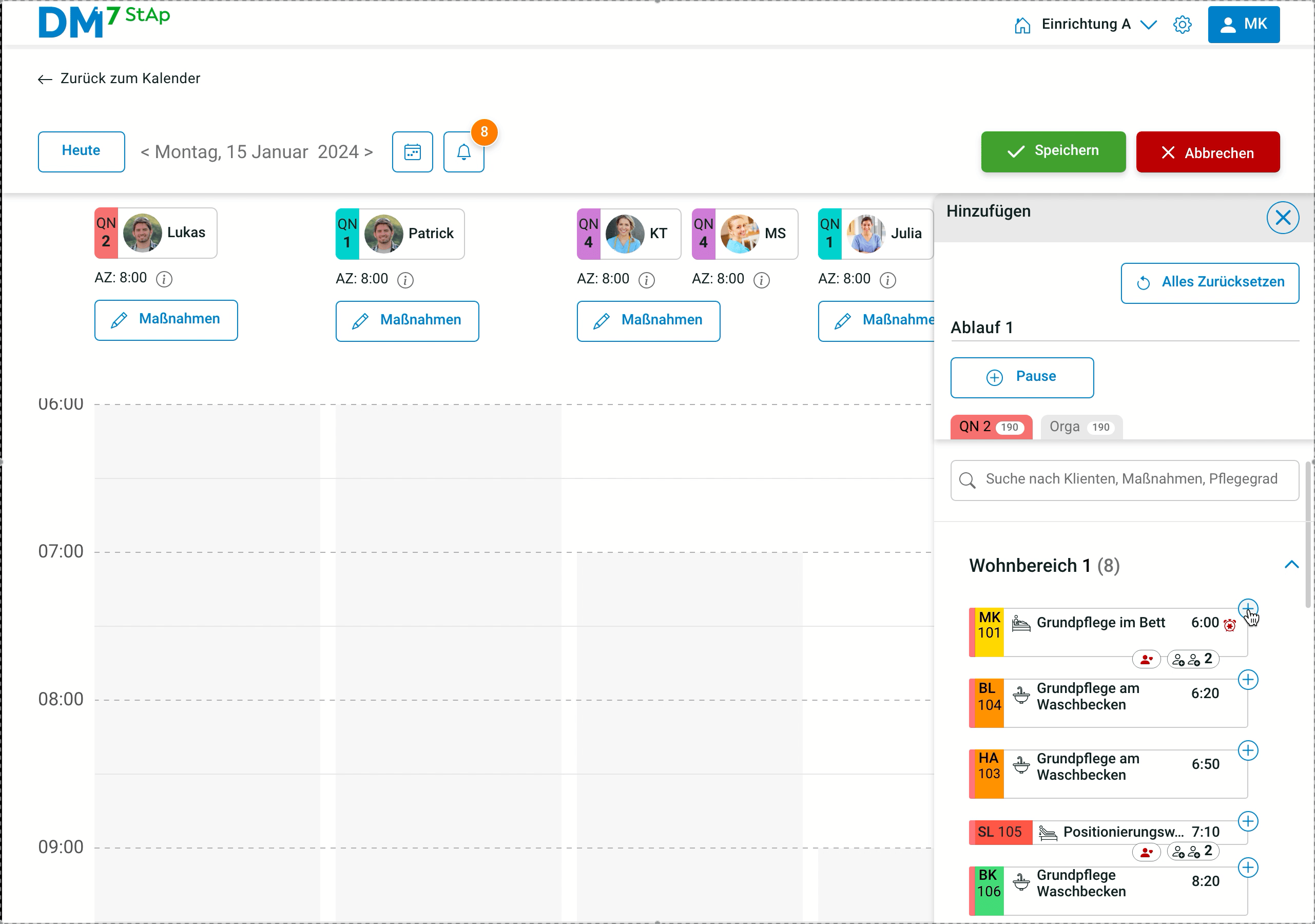
One of the user story and clickable prototype
Planning a day for QN2 Employee:- A shift planner would like to plan 8 tasks from living area 1 for Lukas (QN2) on 15 January and see how many hours he has planned for him.
Select the date
View Luke's schedule
and select measures
Add 8 measures for Lukas

Indicates not fully planned
See selected measures and planned worktime
Validating with target users
Remote usability tests revealed that our basic user flow is 100% successful and headed in the right direction, allowing us to move on to the next feature.

Navigation
Users easily navigated between notifications and planning for adjustments.
Core task completed
Users understood planning for three different carer categories.

Visibility
Few icons were not legible enough to read.

Findings
Since the target group (40+) was unfamiliar with user testing, two employees tested together.
Mistake
There were only four tests. I could have planned 2 testings for basic userflow and next 2 for testing
next features.
Achievement
Bei User Testings überzeugte Kshitija mit ihrer freundlichen und professionellen Art, die von den Kunden sehr geschätzt wurde.
- Nursing Manager
Benefits of collaboration with external service
Feedback from the external services team (developers and a UX designer) focused mainly on improving visual consistency, frictions to reduce development costs.
Overlapped tasks

The execution to show overlapped tasks can be displayed like medical care, because showing all of them is not practical
Card style

A component is needed to ensure consistent styling across the different card types

Standarising Design Library
I used an analogous color scheme for patients measures because these are all related with care.
I standardised the icons maintaining same style a for each task
to aid foreign (non-german) employees with visual cues.
Decisions on UI Components

1
First name will be used due to less space if there are duplicates, the first letter of the surname is added.

3
Before assigning the task, an icon appears if two people are needed.

2
Grey tasks indicate deactivated patients (home/hospital).

4
The icon will turn green when the task
has been assigned.
Metrics I would have liked to track...
-
Pecentage reduction in time for shift planning.
-
Percentage reduction in overtime of staff.
-
Increase in staff retention rate.
Impact
-
My research mapped the full shift-planning journey,
exposing key user pain points and frustrations.
-
My high-fidelity prototype enabled the company to pick the best of three external providers for final product development.
Lesson learnt
-
I learned to collaborate across teams, stay adaptable,
and clearly advocate for design decisions to ensure alignment."
bottom of page